Model Health
Model Health
Aneira
Services
Product Design UX / UI Brand design Data Visualisation
Description
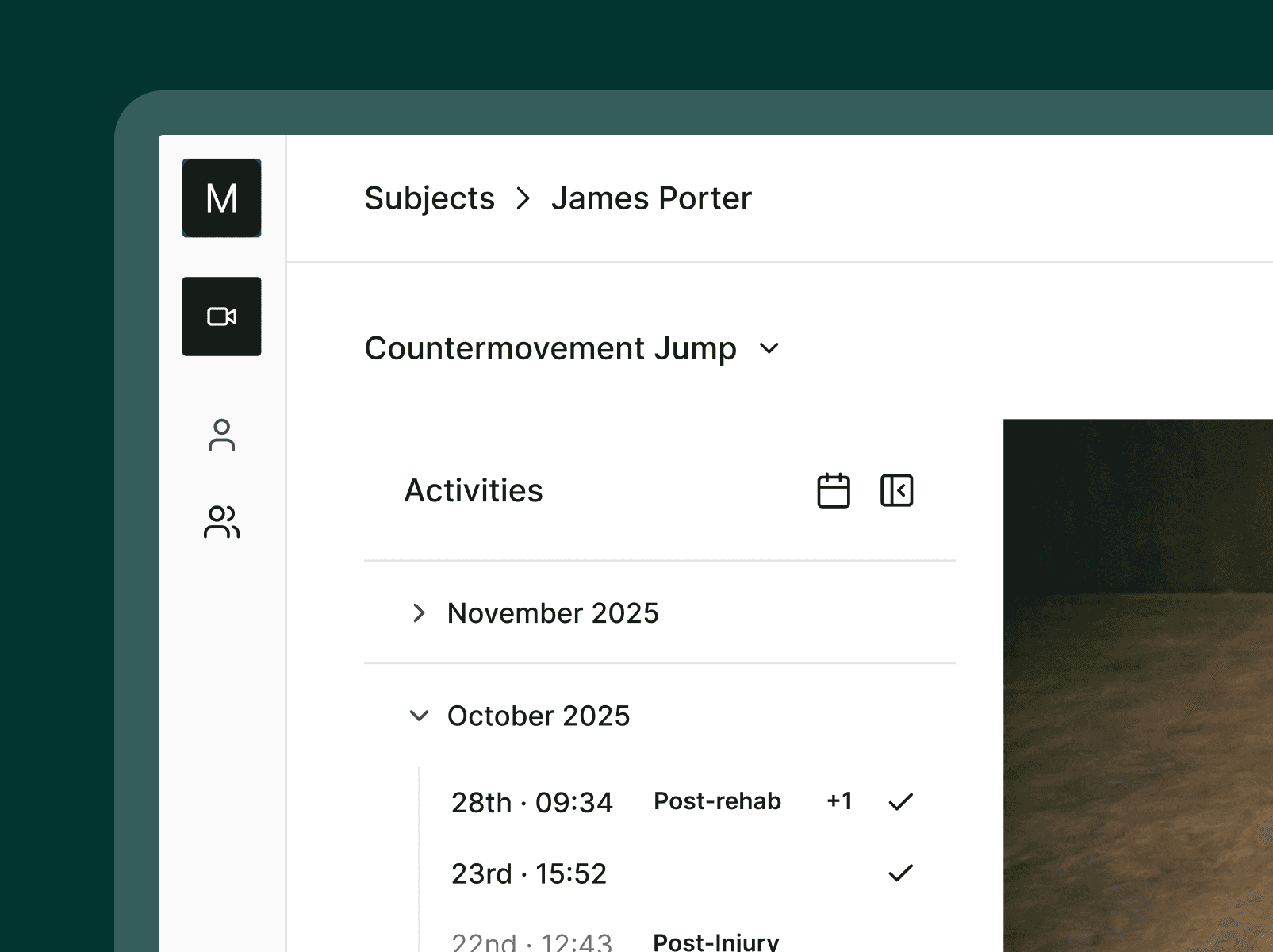
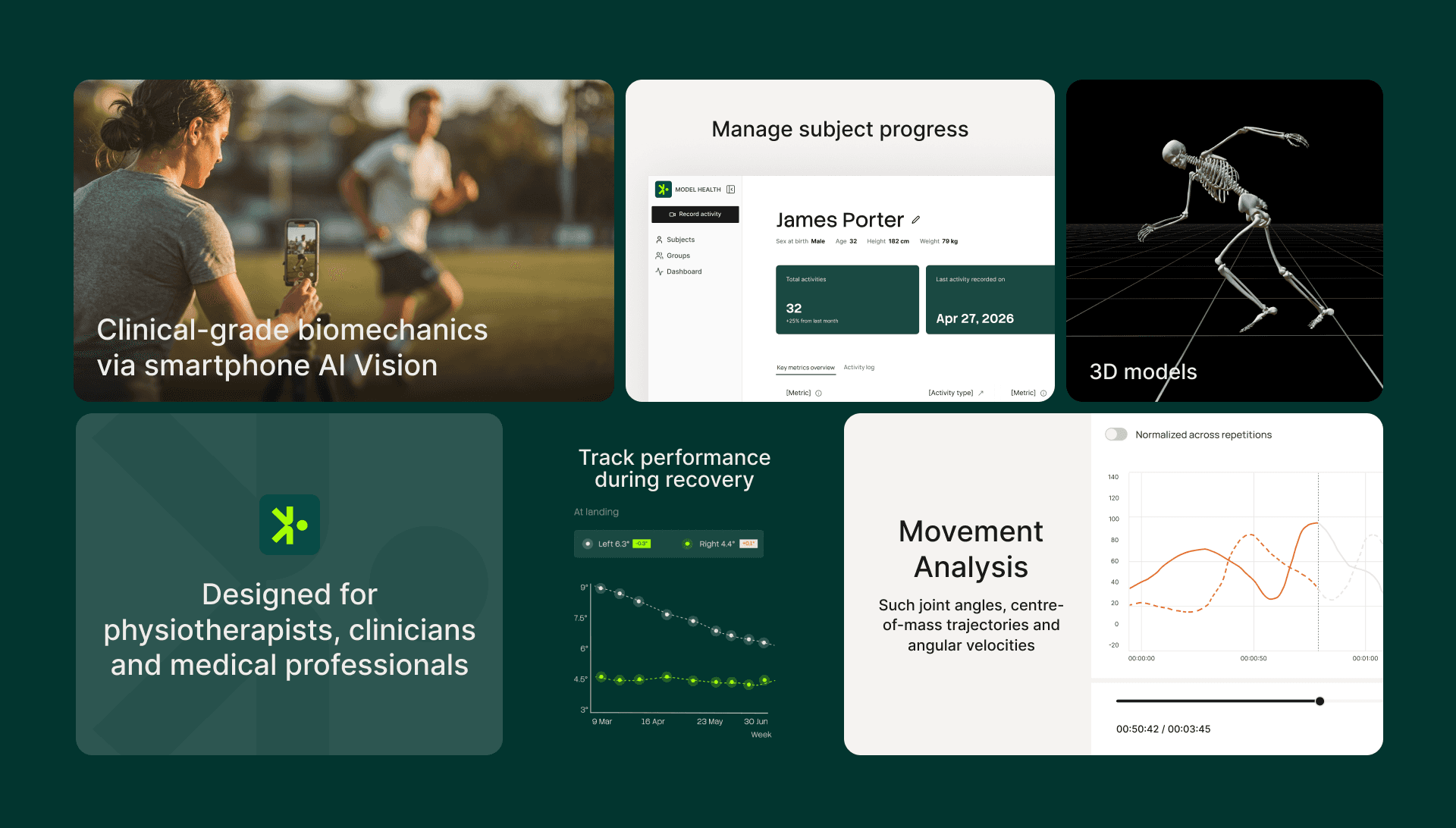
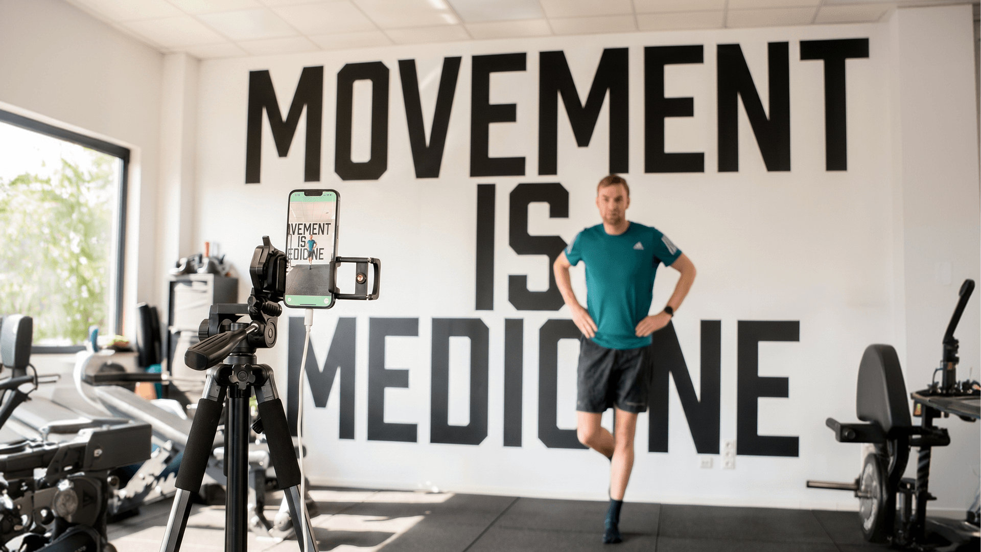
Model Health had something most startups spend years trying to build: a platform that genuinely worked. Up to 28 camera angles. Three-dimensional skeletal overlays rendered in real time. Time-series metrics that tracked movement across sessions and let practitioners compare subjects side by side. Clinicians, physiotherapists, and sports professionals were starting to use it. The product had just one problem, it had been built by researchers, and it still thought like one.
Services
Product Design UX / UI Brand design Data Visualisation
Description
Model Health had something most startups spend years trying to build: a platform that genuinely worked. Up to 28 camera angles. Three-dimensional skeletal overlays rendered in real time. Time-series metrics that tracked movement across sessions and let practitioners compare subjects side by side. Clinicians, physiotherapists, and sports professionals were starting to use it. The product had just one problem, it had been built by researchers, and it still thought like one.
Year
Timeline
6 weeks
Location
Brussels, BE
Overview
Our approach centered on translating strategy into a structured design system. We developed a visual identity that balances clarity and precision, supported by a flexible UI framework. Typography, spacing, and interaction patterns were carefully defined to create a consistent experience across product and communication layers, ensuring the brand remains recognizable and scalable as the platform evolves.
Movement quality scores buried behind raw metrics. Playback tools that rewarded patience over speed. Screens built for someone with time to explore, not a practitioner mid-session with three patients to see. The interface had never asked what a clinician actually needed when they sat down with it. Model Health knew this had to change. They were under pressure to get the product into development and in front of clinical users, and they needed a complete redesign, not a polish.

“The product is getting great response from the market, since release a month ago, we signed 2 premier league UK football clubs, plus one in Italy and 3 in Belgium”
Nicolas Bellemans Co-founder, Model Health
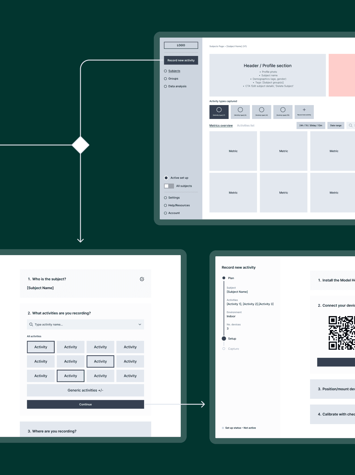
Working wireframe-first let us confirm the clinical logic before any visual design began, but colour turned out to be the hardest problem on the project.
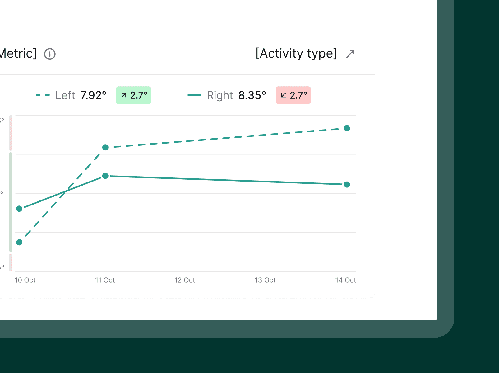
The brief covered the full product surface: sign-up, onboarding, subject management, session recording, activity analysis, charting, and comparison tools. Several of those areas involved complex data visualisation at the same time. Locking product logic before visual design began meant every decision rested on something confirmed rather than assumed. Then colour arrived as its own problem. Left versus right. Performance status. Subject comparison. Visual hierarchy across dense chart layouts. Four systems, each needing distinct meaning, all sharing the same interface. Most of the design effort went into making them work together without contradiction, sorted out in close conversation with the Model Health team.


Model Health now has a product experience designed for the practitioners using it, and the platform's capability finally has an interface that reflects it.
Clinicians can move from a session recording to a clinical insight without navigating a product designed for academic research. The 28 angles, the skeletal overlays, the metric detail. The capability was always there. Now the interface matches it.
Outcome
Our approach centered on translating strategy into a structured design system. We developed a visual identity that balances clarity and precision, supported by a flexible UI framework. Typography, spacing, and interaction patterns were carefully defined to create a consistent experience across product and communication layers, ensuring the brand remains recognizable and scalable as the platform evolves.
Our approach centered on translating strategy into a structured design system. We developed a visual identity that balances clarity and precision, supported by a flexible UI framework. Typography, spacing, and interaction patterns were carefully defined to create a consistent experience across product and communication layers, ensuring the brand remains recognizable and scalable as the platform evolves.
Overview
Our approach centered on translating strategy into a structured design system. We developed a visual identity that balances clarity and precision, supported by a flexible UI framework. Typography, spacing, and interaction patterns were carefully defined to create a consistent experience across product and communication layers, ensuring the brand remains recognizable and scalable as the platform evolves.
Movement quality scores buried behind raw metrics. Playback tools that rewarded patience over speed. Screens built for someone with time to explore, not a practitioner mid-session with three patients to see. The interface had never asked what a clinician actually needed when they sat down with it. Model Health knew this had to change. They were under pressure to get the product into development and in front of clinical users, and they needed a complete redesign, not a polish.
“The product is getting great response from the market, since release a month ago, we signed 2 premier league UK football clubs, plus one in Italy and 3 in Belgium”
Nicolas Bellemans Co-founder, Model Health
Working wireframe-first let us confirm the clinical logic before any visual design began, but colour turned out to be the hardest problem on the project.
The brief covered the full product surface: sign-up, onboarding, subject management, session recording, activity analysis, charting, and comparison tools. Several of those areas involved complex data visualisation at the same time. Locking product logic before visual design began meant every decision rested on something confirmed rather than assumed. Then colour arrived as its own problem. Left versus right. Performance status. Subject comparison. Visual hierarchy across dense chart layouts. Four systems, each needing distinct meaning, all sharing the same interface. Most of the design effort went into making them work together without contradiction, sorted out in close conversation with the Model Health team.
Model Health now has a product experience designed for the practitioners using it, and the platform's capability finally has an interface that reflects it.
Clinicians can move from a session recording to a clinical insight without navigating a product designed for academic research. The 28 angles, the skeletal overlays, the metric detail. The capability was always there. Now the interface matches it.
Outcome
Our approach centered on translating strategy into a structured design system. We developed a visual identity that balances clarity and precision, supported by a flexible UI framework. Typography, spacing, and interaction patterns were carefully defined to create a consistent experience across product and communication layers, ensuring the brand remains recognizable and scalable as the platform evolves.
Our approach centered on translating strategy into a structured design system. We developed a visual identity that balances clarity and precision, supported by a flexible UI framework. Typography, spacing, and interaction patterns were carefully defined to create a consistent experience across product and communication layers, ensuring the brand remains recognizable and scalable as the platform evolves.


